Saturday, October 23, 2010

up to?

welllllll..........I have been so happy busy these past few weeks. I have printed out copies of my Ferlin and His Paper Hat book to send on their way to the publishers for consideration. I have scanned in all of my finished pastels of Ferlin, which I had been putting off for a very very very (yes that many very's) long time. And.........my husband and I opened up our apartment for the fall variety of the Saint Paul Art Crawl just two weekends ago.

For my book I made five copies, four to be sent out and one for myself to have for shows and such. I printed it out at the local staples and cut it all down at home with our paper cutter of xacto brand. And I put everything together with small little zip ties and clear sheet protectors, cut down to my page size.
 Before sending it on it's way each submission needs a particularly special letter to the editor as well as copies of my page spread done in pastel, (as I intended the book to be finished.) I am putting the finishing touches on those letters and will take a happy picture when I do my send off.

In my other news the Saint Paul Art Crawl was super! I always love how our space is transformed in a matter of exiting and fast paced hours. The week before it I was forever visiting goodwill or michael's to buy up frames and various other necessities for the show. We had a wonderful weekend and I even donned my apron to make some gnome, bear, and squirrel cookies. Magnets as always were quite popular and many people admired my Ferlin book, wishing me good luck on it. In the end our furniture was all moved and moved back again within four days.

So that is what I have been up to for the most part and making room for new things to come my way.
Here are all five of my sweet little Ferlin books, bound and ready for submission.


Three gnome cookies. They were Pillsbury sugar cookies with added mint extract and turquoise food coloring. Decorated with black sparkly gel icing! Yummmm!


This is part of our living room transformed for the art crawl. You can see some of our prints hanging on the grid in the back and my Ferlin pastels on the wall.


This is the other half of our room. Behind the partition is where our studio is located. By the window is Joe's painting, his comics are displayed along with my paintings.


More cookies! On the very last day I made pink squirrels and bears with white frosting.


The shape of wings to come...they're done!

A few weeks ago I finished the wings just in time to send them off to be worn, to what I am sure was a fabulous Halloween party. They turned out exactly as I hoped they would, full of iridescent shimmery-ness. I took lots of pictures with my phone during the whole process in order to show it here and also be able to remember for myself how I made them. So where did I leave off......well I had modge podged some fabric, cut it out into a wing shape, and sewed on some wire.

From that point I cut out two more little shapes in the modge podged thin canvas and added more wire for reinforcement. After everything was good and glued down with modge podge I drew up some shapes to cut out of the wings. I drew on tracing paper (my favorite) and transferred the image to the wings by going over it with a pencil. Then I tried to cut the shapes out with a scissor, which didn't work, but luckily an xacto knife worked very well. After it was cut I got to paint!yay! I chose yellow with a mix of iridescent paint for the back and pink and yellow for the front of the wings. After they were dry I glued shimmery see threw fabric to the back so that it showed threw all of the shapes I had cut out. I made sure to top everything off with plenty more iridescent paint and gloss varnish medium as a final protective coat. I was so pleased with the end result and I know my sister felt so special wearing them. She fit rite in with the rest of the fairies!
This is a small bit of thin canvas I sewed a piece of bent wire to. I adds more stability and helps them bend at the right place.
Here is the above piece as it is glued to the wing.

Both supports are glued on with modge podge and I'm ready to draw some designs to be cut out.
I sketched some designs on tracing paper and then flipped the paper over and traced so that the graphite would transfer onto the canvas. You can see the way it transferred on the right.
Here is where I started to cut out some shapes.
One whole side of the wing is cut out.
Getting ready to paint the front of the wings. I tried out my colors on a scrap of canvas to see how my blending would go.
One side of the wing painted, although I did go in again to add some more highlights.


The back of the wings got painted yellow and sheer iridescent fabric was glued on.
The front of the wings as they are finished, with a coat if iridescent paint and gloss varnish medium. The sheer fabric glued on the back is yet to be cut.
And finally they are done and in place. Very pretty!
The wings get their close up!

You can notice the holes that I made for decoration are actually very functional if you want to hang up the wings or tie them on instead.
Close up of the back of the wings were they bend.
I just had to try the on myself. Lovely.

Tuesday, September 28, 2010

feeling forlorn about your figure drawing skills?

While Dr. Sketchy's has the cure! Dr. Sketchy's Anti-Art School is the drawing class that convenes at a bar near you. Artists get the opportunity to draw "glamorous underground performers" in sparkly revealing costumes. It's the figure drawing experience you always wish you had where the models are full of good humor and exude kitchy pin up goodness. My husband and I just attended our local chapter of Dr. Sketchy's and when I went  to their site I realized it is actually attend-able in 100 cities around the world!

How it worked,
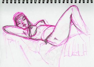
We packed up our sketchbooks, pencils, and pens and sat down at the bar. The model came out wearing a  tiny costume with a vest that tied in front and a skirt made of two fabric panels. She had a raven haired wig with a headband and accessorised her look with a bow and suction cup arrow. There were a few warm up poses that were 2 minuets each, and then maybe two more poses for five minutes. The model did a fun little strip tease where she minimized her costume and after a small break did two longer poses for about 30 minuets each. I had not had a drawing session since college and I rarely sketch so the class was very beneficial. It is hard not to judge one's own drawings but I was very pleased with my last one. They are all quite loose and full of energy at least.
This is my best-est drawing from the class. I used a pink marker first to get more of the gestural lines and added pencil to get more detail.
Closing thoughts,
Unlike the studio drawing classes (in school) the atmosphere was much more just, fun. The addition of the costume was great and added a theme to the session. As an attendant you had the ability to draw what you wanted and focus on what you needed to get out of the class. Whether it was  how many drawings you did or how technical you wanted your drawings to be. The atmosphere was relaxed but still professional and respectful. I would and will go back again!

so join the "sketch revolution" and find a branch near you! visit their site at www.drsketchy.com
you can also visit my husband Joe Rheault's blog to see some of his sketches from the session at www.dirtyinks.blogspot.com

Monday, September 20, 2010

the shape of wings to come

My sister is going to be attending a fabulous Halloween party. My mother is sewing her a beautiful fairy costume and I am doing my part by creating wings.

There are a lot of different ways to make wings and most places I’ve found suggest nylons and netting. However I wanted a fabric that was really durable and it just so happens that I have a lot of canvas scraps,so that was my number one choice. In deciding the size for this particular project I knew the wings needed to be small in order to be attached to my sisters wheelchair and allow room around the handlebars for her to be pushed. If my sister isn't feeling like wearing them they also need to be a size that can be stored easily.

Just as I was about to draw out my wings I came upon a nifty wing shaped hanger that I found at my local patina shop. It was the perfect size and shape to give me an idea for the pattern. I began by tracing the "wing hanger” and drawing it into my very own wing shape. Meanwhile I hardened a piece of canvas by painting it with a few coats of modge podge. This made the canvas easy to cut out and there was no fraying of the fabric. It also made it water resistant, ready to paint, as well as giving the fabric some stiffness. I thought the canvas would be stiff enough that I could just paint it and put some ribbons on it,but alas it needed wire.....

Sooooooooo I modge podged another piece of canvas. This time it was a lighter weight canvas that was the texture and weight of linen. After that was dry I cut it into a shape that would offer the wings support. I also hand sewed a thick piece of aluminum wire that I had bent into the shape of the fabric. The wire was bent in a shape that would offer support and could be clipped into a garment or in this case a wheelchair seat back. After the wire was sewed on the canvas shape,I glued it (with modge podge) onto the large wing shape.

This is what I have done on the project so far. 

1.painted 2 types of canvas with modge podge
2.cut out 1 wing shape in thick canvas
3.cut out 1 support shape in thin canvas
4.bent a piece of thick aluminum wire and sewed it to support shape
5.glued support shape to wing shape

Here are some pictures so you can see what I mean.
This is the wing hanger and the paper underneath it is the shape that I made for my my own wings.
This is the hanger along with my paper wing shapes and the real wings themselves. I drew the half wing shape first and cut the larger shape on a fold like you do do when you cut out a paper heart.
Close up on the wire detail and shape that I glued on for support. Be sure to only sew the top part and down toward the center a little. Leave room so it can work like a paper clip and clip into your garment.

Even closer on the part I sewed at the top of the wing.
This is how the counter looked the other night as I was working.
The wings aren't quite finished but I had to go try them on. Since they have wire they can be bent in half to look more flutter-y.

Tuesday, September 14, 2010

a create-shop full of heart!

A friend of ours the abundant empress is hosting a lovely event on October 2nd. It will be an art party where participants will all create a work of art inspired by the event. There are openings for twenty people to join in the half day workshop. It promises to be a day "filled with fun, fellowship, and creative play." And "you will come away with an original, signed work of art created not only BY you, but specifically FOR you by the others in your group." Each participant will be provided with art supplies, snacks, and beverages.


It sounds as though a lot of fun will be had, acquaintances will be made, and new artful friendships will be formed. Most inspiring!


for further details please visit her blogspot on the subject here.
abundant hearts collaborative create-shop

Thursday, September 9, 2010

a Kermit poster correction

It was brought to my attention by a certain lady, we will call her "mom" in this scenario, that the Kermit poster from a previous post was not a dentist giveaway as described. As a public health nurse back in the day my mom received it as part of a teaching campaign. She proudly used it to promote clean teeth to the youth of America. I believe it was followed in the subsequent years by her memorable scrubby bear outreach program about a bear who always scrubs/washes his hands on every occasion but not obsessively. Thank you again for the poster mom....it has been truly enjoyed throughout the many years!

Bla la log

I have been a busy girl as of recently (but really aren't I always,me? Yuppers you are, you.) I have a great post coming up about my new wardrobe acquisitions as well as one if not a few posts about a pair of wings I am making for my sister. I will also have a rather long post in late sep/early oct about visiting and volunteering in Mankato this summer cause I did a few times with a truly lovely girl of mine. So that's what's up with me and as always I am thinking about paintings and dollhouses and drawing and sketches and pictures and organizing and fabric and movies and um lots of other stuff don't you know....

Sunday, August 29, 2010

my small history of clean teeth


Animals need clean teeth too. At least that is part of the advertisement in this Colgate add from 1911. I found this little book at my local Barnes and Noble which has a wonderful used book section. The book is a rhyming sort of essay/ode to animals who come upon a tube of Colgate and realize how sparkly and healthy it makes there teeth. All the animals without teeth are saddened that they don't get to experience this new fad that is sweeping the jungle.


This is the book I just bought. See how cute yet informative it is! This is my favorite page spread. I especially enjoy the crocodile who is holding the large tube of paste. I must note as well that the these colorful illustrations are from the book "The Jungle Pow-Wow" by Jessie Imbrie Miller. It is copyright 1911 by Colgate & Co.

Not only do I love this book but finding it inspired me to show you a few of my favorite childhood possessions that have to do with the art of tooth brushing. In looking threw these ordinary objects around me I see that I have always understood the importance of clean chompers and I also realized how some of these objects have inspired me to integrate tooth brushing illustrations into the books I have worked on so far. I had never even noticed!

This is a picture from the book "Theodore Mouse Goes to Sea" where a brave little mouse sets out to sea to fill his life with adventure, but not before he brushes his teeth. It is a lovely book of the golden spine verity that was always a classic with me. Illustrations are by the great Lucinda McQueen, I gotta give props! Look her up she has done absolutely amazing illustrations threw out the years!
This picture was just used to give evidence to inspirations from childhood. Text copyright is 1983 by Michaela Muntean and illustration copyright is 1983 by Lucinda McQueen. It is a little golden book.

This is my childhood toothbrush holder which I have gracing the top of my jewelry cabinet. Although not currently in it's former use it is still loved and enjoyed everyday as I pass by it. I find that hello kitty always brings a touch of classic whimsy to any room, don't you?
Again this photo is used only to show the whimsical nature of my childhood influences. It is Sanrio copyright 1976 as all Hello Kitty items seem to be.


This is the retro poster I have hanging in my bathroom. It has always been with me even if sometimes in storage. I must have gotten it from the dentist when I was little and when I first started to date my husband I gave it to him to show how cool I was and he promptly put it on his wall(yay desired affect!) Kermit is always watching and sending his approving glance at those pearly whites. He always looks so cheerful, it makes you want to brush, floss, annnnnnd use mouthwash.
The poster is from 1985 in honer of national Children's dental health month. Kermit the frog is Copyright © The Jim Henson Company and is only used to show childhood influence.
 The last two pictures are my very own illustrations. They show my characters in their respective bathrooms brushing their teeth. When I went to do this post I knew that these pictures would fit right in. They would help me to write the post and make it personal (as this blog is supposed to be, i say.)

Both pictures have been illustrated by me and as with everything on this site they are copyright 2010 Megan Rheault of Pixie girl studios.
This is a pastel illustration from 2005. The book it belongs to, with some 39 large pastel images, remains unpublished. I am very proud of the work and am still amazed at myself when I look at the pictures. They are so pretty and the colors are so bright.


Here is my dear little cat creation that you may have seen in my previous posts. This picture is a pencil drawing that has been scanned into the computer and colored in photoshop. I intended this to be a color study with the final version to be done in pastel.
With the end of this post I can say that the subject of tooth brushing is something I hadn't really thought about. But then again seeing all of these images I realize I always had. So maybe we can be inspired to pay attention to the smaller everyday things or realize what we pay attention to - even though we think we don't.............
And may we all understand the importance of keeping the cleanness of teeth alive!

Tuesday, August 24, 2010

dearest little blog of mine

I didn't get to do my second post for last week but I accomplished a major goal of mine, so I still definitely win. I finished doing revisions to my children's book that I am writing and illustrating. In my previous post I showed a change in two different layouts which is similar to what I did for most of my 18 page spreads. All the revisions make my book easier to read and graphically stronger. Now I am ready to print out copies of my book and send them to publishers and editors. This is a project I have been working on for years and to have it to this point is quite a milestone in my whole process. When I do print copies and send them I will take pictures as a farewell to this stage and as a sign of a new "chapter" to the story behind my little book.

So dear little blog you see I haven't forgotten you, I was just saving up my good news. I have some great posts planned for my future writings to you. Really good ideas coming up!!!!

Tuesday, August 17, 2010

building blocks..... of text

In getting my children's book ready to be sent out I have been doing a lot of work on it in the past few weeks to make all those final adjustments. One of the biggest things I did was to go back through the book and look at how readable all of my text was. Being an illustrator, pictures seam to be the most important part but really the words are just as important. After all I want people to read my story and that's the goal. Next time i'll think about how I integrate the text more as I start my book. Text shouldn't be an afterthought cause its really important and if it isn't incorporated it takes you out of the story. So those are my little thoughts about my words.

This is one of the first pages of my book. Notice how the text is very hard to read because of the background color. There is also a lot going on in the picture so the text needs breathing space as well so your eyes can pay attention to it.

I drew a paper with folded corners and put in behind the text to maker it stand out and easier to read. Hopefully it also anchors the picture and makes your eye move around the page.

The words on this page are really not that bad, but they could be better. Again this is a highly detailed page and the words blend in just a little to much with the background.
The words become easier to read now with a lighter color behind them. The bricks in the back lend themselves to making a shaped boarder for the words.
  These are two pages of my final color mock ups.